The digital world is constantly moving, growing and changing and the way you can build your site is too. If you already use Website Builder, you may have noticed some shiny new features when editing your site. If you’re not using our builder yet, then here are even more reasons you should be!
So let’s get straight to it, what’s new?
What’s new in the latest Website Builder update?
New image shapes
We don’t know about you but we’re super excited about the new ‘image shape’ option. Now you can – you guessed it – change the shape of your image! It sounds pretty simple, but it can have a huge impact on the design of your site, allowing you to personalise it even more and get really creative with it. In fact, when you use Website Builder, you now have 10 shapes to choose from, including ‘cross’, ‘arrow’, ‘lines’, ‘hexagon’ and more.
Switch up your ecommerce layout
If you have an online store, product filtering is pretty much at the top of any priority list. Easy product navigation equals a better user experience and a happy visitor means a visitor is more likely to buy from you. And with this new update, you now have even more choice with how you display filters on your products list page in Website Builder.
‘Add content’ panel refresh
Alongside other UI updates, the ‘add content’ panel in our Website Builder has been given a much-needed makeover. It’s been restyled and refreshed and the overall layout has been improved so now you can see even more section previews. Now you get a clear view of all the possibilities, quickly visualising what your content will look like and what fits in with the amazing-looking site that you have in mind.
What else is new in Website Builder?
Like we said, when it comes to the world of digital, things are always moving and changing and the same goes for our Website Builder. In case you’ve missed it, over the last few months there have been loads of updates, improving how you edit your site and the cool things you can do with it. So, what have you missed?
Height settings
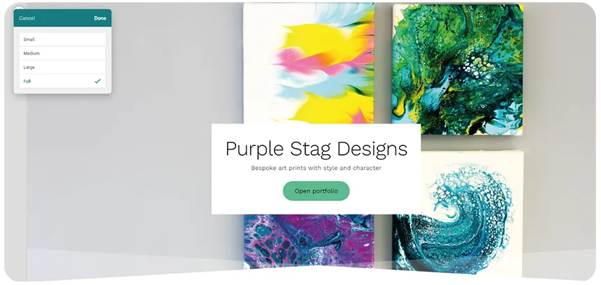
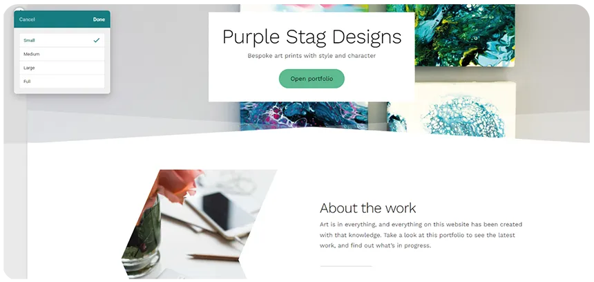
It might seem like another small change, but sometimes you just really want a section to be smaller. Or maybe you need it to fill the whole screen? Well, now you have more height options so you can do exactly that!
Full height section
With the ‘full’ height option, you can expand a section to fit the full height of the screen, ideal for eye-catching header sections or feature images.

Small height section
Whether you want a subtler header section or a slim and sleek ‘About’ section, you can use the new ‘small’ height option in Website Builder to reduce the amount of space between sections.

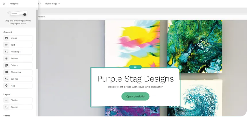
Better widget panel
Remember that pop-out widget box? Well, that’s gone and it’s been replaced with an all-new widget panel that opens out on the left. Now you can see all your widgets in an easy-to-view column – simply click ‘add content’ > ‘add widget’ and away you go!

New section designs
If you haven’t already found them, we’re here to tell you about the amazing new section designs you can choose from when you build a site with our Website Builder. Want to show off your brilliant team? You got it, with new ‘meet the team’-style sections. Looking for a new way to display your contact info? Try out the new contact sections. After a different way to layout your text/image content? Use one of the new image and text layouts.
If you’re as excited as us about all these new Website Builder features, log in to your Control Panel and check them out for yourself. If you ever have any questions about the products that you use, our pro support team is here to help 24/7.
